“There are three responses to a piece of design,” said legendary graphic designer Milton Glaser. “Yes, no and WOW! Wow is the one to aim for.”
Good websites employ wow-worthy design. But they also use tools that make your home on the web welcoming, engaging, inviting, orderly – reflecting your business’ personal style, voice and brand.
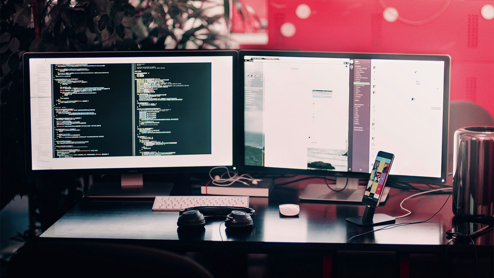
We asked our team of web designers to identify the top five web design trends to watch in 2019:
Bold Typography
Typography is now the little black dress of websites. It’s everywhere, being used as a vehicle to allow brand personality to shine through. Typography sometimes overshadows images as the feature design element.
Serifs are back. These fonts with flourishes are also sleek and take up less space using fewer pixels on websites. Sharper resolution has allowed designers to incorporate more custom fonts that help express a brand’s personality by adding extra emphasis to mere words.
Sticky Navigation
Framing websites using sticky navigation allows designers to keep certain elements at the top, bottom or sides of web pages without disturbing the user’s experience.
It’s great for highlighting promotions, calls to action or a fun tagline. And it’s perfect for providing a permanent home to your social media links.
Overlapping Design Elements
When done right, overlapping design elements give us the unexpected.
They provide a visual road map, guiding your eye down the page from one interesting visual element to the next. Instead of the typical space reserved for content, we bend the rules overlapping items — enhancing the aesthetic of the website overall.
This technique can be fun and stimulating, but one wrong move and you can frustrate and confuse the user when design elements clash.
To get it, you need to see it. Take our client Achieve Palm Beach County. Here, we’ve overlapped design elements – photos with backgrounds that have shapes, text boxes that lay over photos or cut directly into them. Implementing this technique disrupts your expectations while highlighting the information.
Broken Grid and Asymmetrical Design
The unexpected is everything in this design trend. Typically, websites follow grid patterns. You’ll see the systematic order of things in the layout of most websites. Here are some ways your website can break the internet, by breaking the grid.
- Using animation is one way to cross the line with moving elements.
- Parallax scrolling also breaks the grid by using a layered technique to drive you through the design elements. Using various speeds creates an almost three-dimensional effect.
- Positioning accent elements off the grid but using neighboring elements to tie it into the page. Employing color or font makes it cohesive with a splash of the unusual.
Our client, The Royal Poinciana Plaza, is all about sophisticated, upscale, artistic style. Using broken grid gave us the ability to speak their brand right out of the gate.
Parallax scrolling allows you to take the wheel on this visual show which is entertaining – right down to the iconic Rolls Royce curser that makes pointing and clicking interactive fun. Hover over text boxes and they’re brought to life with just a hint of movement.
Micro-animation & Movement
Scrolling through a visually stunning website is more fun when design elements pop up unexpectedly. It’s that playful element of surprise that intentionally catches you and makes you pay attention to the content that’s literally popping before your eyes.
Giving visitors different ways to engage with your site will bring them back again and again. This interaction also helps to create a bond with your brand. Having forward-thinking design that employs connectivity speaks volumes to your customers, creating feelings of trust. Your brand is instantly elevated because of the way you’ve incorporated technology into a user-friendly experience. It resonates that you care about your visitors having a thoughtful experience.
Our client, Palm Beach Row, is all about movement. In fact, their logo is a wave.
When we designed their website, we were careful to incorporate design elements that accentuated movement. Buttons mimic a wave rolling from one shade of blue to a deeper tone. Photos on the site also appear to move in waves. The movements are unexpected finds you get when engaging with this site.
Build it and They Will Come
Not everyone is a digital artist. That’s why when you’re ready to create a masterpiece, we’re here to help.
Ideabar’s team of data-driven, wildly creative, digital natives tell powerful brand stories in all media.
Creating a website that reflects your brand visually, starts with a big idea. We believe that an idea powerfully expressed incites action. The best ideas convert: Clients engage, tickets sell, students register, buyers decide, patients recall, donors care, and minds change.
Meet us for a “Happy Hour.” The ideas are on us!
Contact Ideabar:
(561) 820-4280
ideabar@coxinc.com